As soon as GPT-4’s “vision” or image recognition features were teased in the research paper, videos of a sketch of a website to a fully functioning site went viral.
Once the feature started to roll out in the app and online, we saw even more napkin sketches and whiteboard scrawls being turned into code.
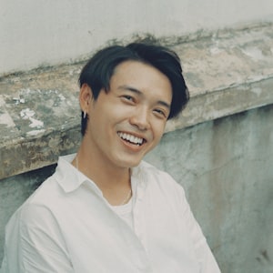
Not one to miss out on a good bandwagon, as soon as GPT-4v was released in Australia I tried it out for myself. Here’s the result (refresh this page to vary the images):
Jordan Mitchell
Empowering Your Business Growth!

About Me:
Jordan Mitchell, a seasoned business consultant with over 10 years of experience helping startups and corporations alike in achieving their goals. Passionate about innovation and always looking for new challenges.

What I Do:
From business strategy development to operational optimization, I provide a range of services tailored to your business needs. My expertise lies in identifying potential growth areas and implementing effective solutions.
Not bad, really. It took a few prompts back and forth, but all up this was a matter of minutes. Obviously it’s not going to replace no-code website creators or human designers right now, but pretty soon I imagine this is going to be a huge factor in website design.
In education, there are some real potential uses for creating portfolio websites, quick prototypes, andstudent projects. Here are some more images of the process.
Creating a website with ChatGPT vision
Step one: the sketch
The first step is about as straightforward as it gets. Scribble out a quick sketch on a notebook, whiteboard, napkin, or a tablet device. Take a photo or screenshot, and drop it into ChatGPT. Currently, the GPT-4v model is only available to subscription users. You can use image recognition in Bing Chat, but the coding capabilities aren’t as strong.

Once it’s uploaded, use a prompt like the following:
Use this sketch to build a website. Go through the process step by step and create a html file that I can copy/paste or download directly. Use images from unsplash as placeholders in the two places I have indicated images. Create some text to fill the spaces. Use borders and headers and anything to make it attractive but stick to the layout of the sketch.


Step two: test the code
To test the code you can copy/paste it into a text file and save it as a .html, or even easier go to a site like w3schools tryit editor where you can preview the code side by side with the result:


It’s OK, and it’s mostly sticking to the sketch. The placeholder images from Unsplash are working fine (you’ll notice they change throughout and if you refresh this page the one at the top will change – it’s using random images), and it has generated the placeholder text. It’s not exactly a finished product though…
Step three: refine the code
The last step is to add some extra prompts to refine the outcome until it looks the way you want. Here are some of the prompts I used next:
make the profile picture image smaller and the banner image full width of the screen. Add a parallax scrolling effect in the background with another image and change the opacity and colours etc so its all still readable

that profile pic needs to be smaller and alongside the about me text

Create a fake name for the website owner. Replace the My Website title with their name. On the right, aligned with the header, create a dummy menu bar that has links for About, Services, Blog, Contact. Populate all of the placeholder text with made up info. Replace the ‘subheading’ with a snappy professional services tag line.

The menu bar looks awful. Can it be a hamburger dropdown or maybe just plain black text links? You could use some other website best practice knowledge to improve the design further. At this stage, I would like you to make some design decisions.

And that’s it! Notice how the process of refining back and forth got increasingly higher in quality and closer to what I was imagining. By the final prompt, I “handed over” some design decisions, and as well as my instructions it cropped the about me picture into a circular frame, and added some bevelling and shadows to the images. The fonts have been updated to a more contemporary font and colour, and the overall aesthetic of the website really isn’t that bad.
Here’s the sketch to the final product:


If you’d like to get in touch to learn about Generative AI in education, join the mailing list or contact me via the form below:


Leave a Reply